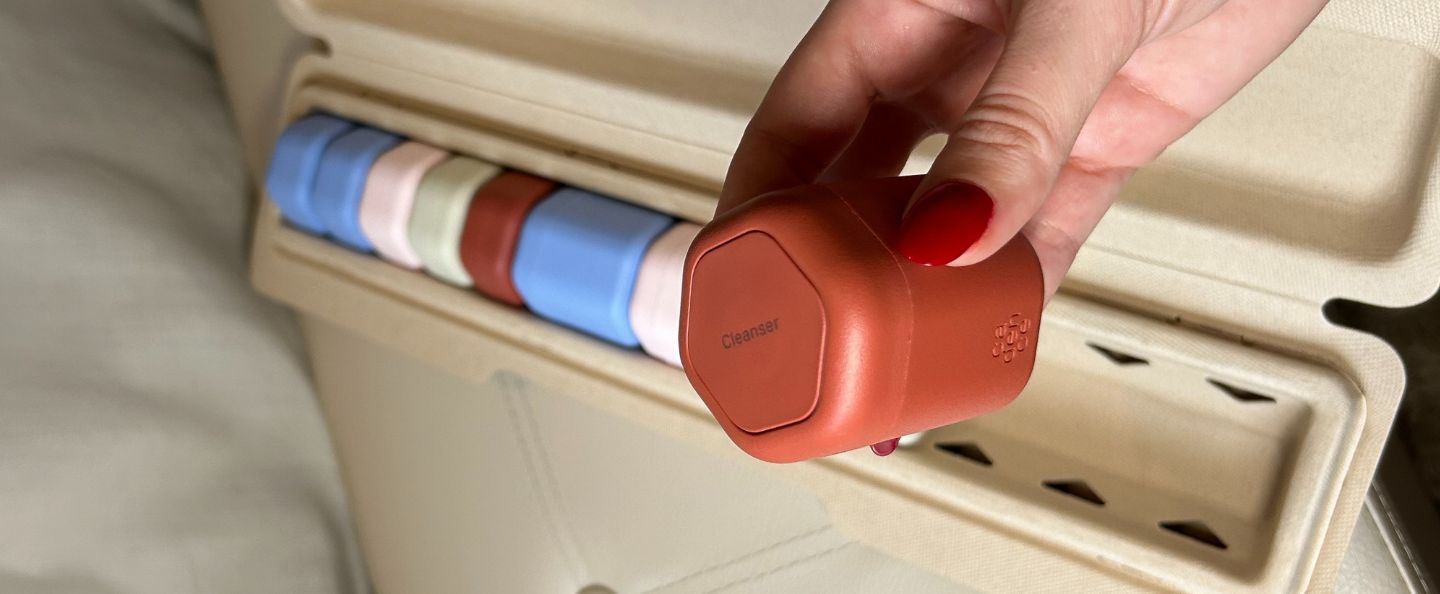
Customization is the name of the game at Cadence, and that starts with color.
The Suite was lucky enough to stumble upon Cadence in their early days. Since then, we’ve watched them rack up accolades (from places like TIME and The New York Times), launch brand partnerships, and unveil limited edition collections. The long and short of it is that Cadence Capsules are life-proof. These screw-on containers range in size and are magnetic, labeled, and TSA-approved for all of your gallivanting (whether it be cross-town or cross-country).
Cadence receives a lot of love for their color collections in particular, most recently the Violet Edit and Neutrals. Every time a customer orders from Cadence, they get to pick the size (0.56 to 2.75 fl oz), label, and color of every single capsule. And while their limited-edition (and quantity) colors are gorgeous, there’s a reason why their Core Color Collection continues to stand the test of time. Purple and brown will come and go, but earth tones are forever.
This is a rundown of the Cadence shades that continue to stand the test of time. Scroll through to visualize your own lifelong Capsule System (and then go build it).
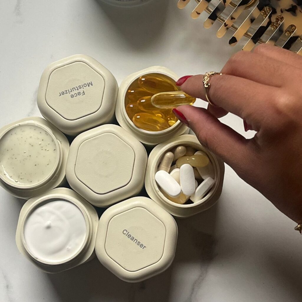
Sand
You know how people like to use the word “dirty” when it comes to hair color (see: “dirty blonde”)? The best way to describe the color Sand is dirty beige. We’ll probably get some pushback for that, but how else to describe it? A cup of cream with a splash of tea, maybe, or Vanilla Bean ice cream. Okay, so that’s better.
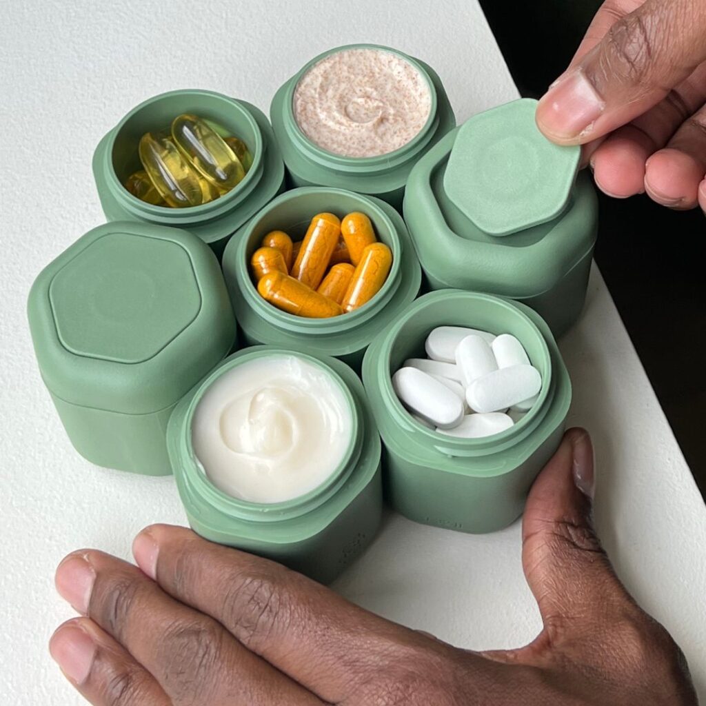
Eucalyptus
This next one is a dirty gree—just kidding. Eucalyptus is a deep sage color, not light enough to be pastel but not quite dark enough for any other name. It’s simultaneously fun and neutral, which is difficult to accomplish.
Lavender
Technically, Lavender is part of the Violet Edit, but unlike its counterparts Lavender will be here long after the others. In essence, this is the perfect shade of purple. It’s not too dark, nor too blue. Would be a good option for a pink-loving friend who’s looking to branch out.

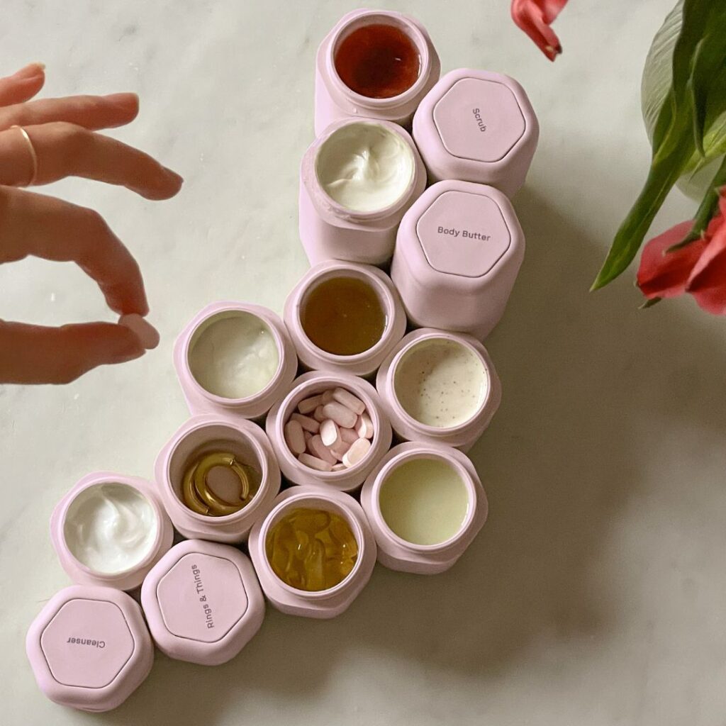
Petal
Then again, Petal is the #1 shade for all of the pink fans out there. Petal is a pale pink, evoking Glossier’s branding or the petals (pun intended!) of a cherry blossom. Somehow, this color also gets away with being both neutral and playful all at once. The not-quite-opaque travel-sized travel containers of our local pharmacy could never.
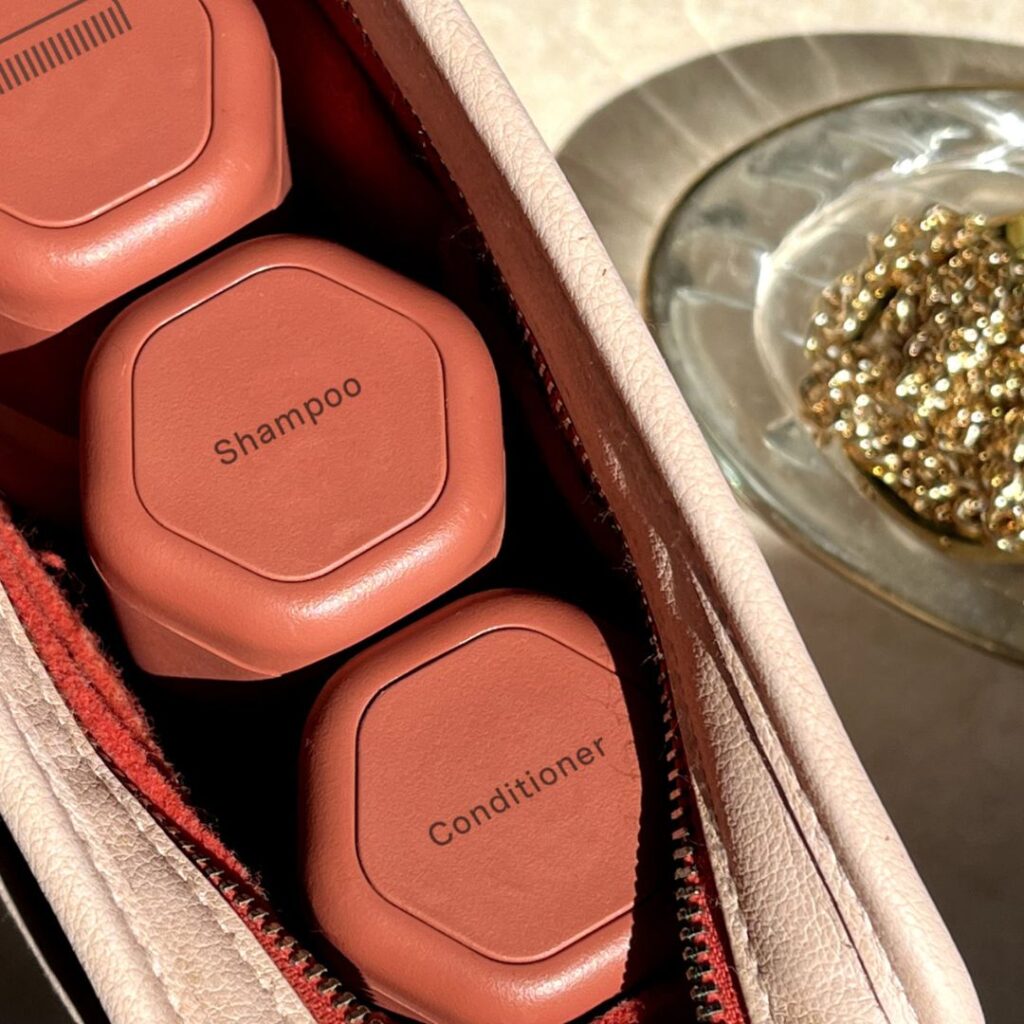
Terracotta
In Terracotta, Cadence takes a beloved color and somehow (?) makes it even better. The shade oft-associated with plant pots is *even more* complex and rich after Cadence gets their hands on it.
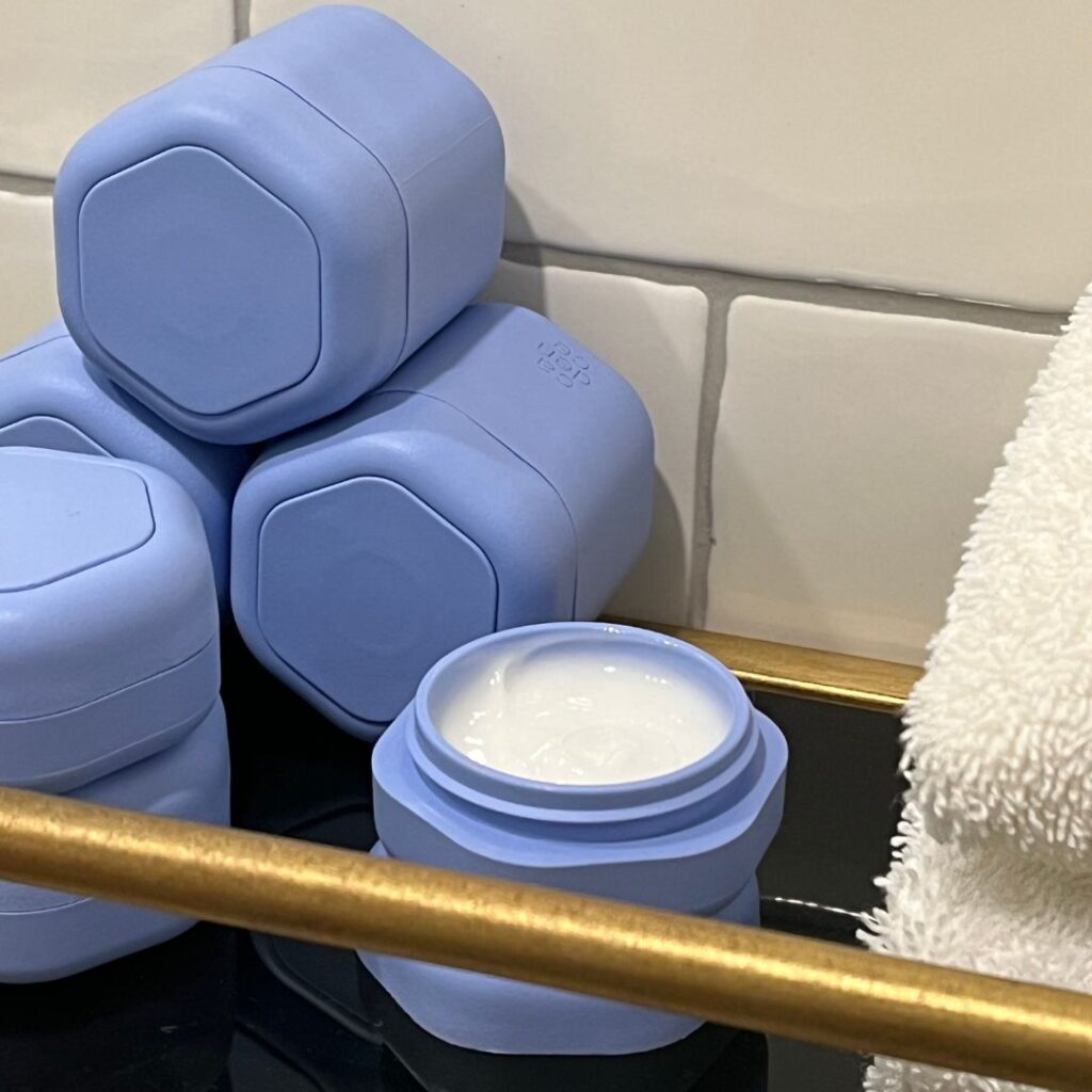
Pacific
Last (but not least) is Cadence’s take on cornflower blue. Pacific is a crisp color evocative of bright skies and sparkling waters. It would look nice with, well… just about every other colorway we’ve run through. That’s quite the feat.
Our Colorful Compliments to Cadence
Steph Hon, the CEO and founder of Cadence, set out with the goal of designing a product that people could shape around their lives, a device that would adjust to the *Cadence* of every person’s unique routines and preferences. Their vast array of color options has served this exact purpose. Exciting new hues are always in flux, but their six Core Colorways have been around for as long as we can remember.
People haven’t stopped talking about Cadence since their establishment in 2017, but their beautiful color options don’t get nearly enough love. We had a lot to say, so The Get Well team took it upon ourselves to deliver.

